

Cart

When you think of Mexican murals, what’s the first thing that comes to mind? Bold colors? Larger-than-life characters? Or perhaps it’s the powerful words, flowing across the walls, telling stories of passion, history, and struggle. But here’s a little twist—what about typography? Yes, typography! That very thing we see everyday but often overlook. In the world of Mexican muralism, typography is more than just letters. It’s a symbol, a voice, and an essential part of visual storytelling that can be surprisingly useful in the world of UX design. But how exactly does this vibrant art form translate to the digital world? Let's dive in!
Typography in Mexican murals isn’t just about arranging words in a pretty way. It’s about conveying emotion, power, and meaning. The muralists, like Diego Rivera and David Siqueiros, used typography to create a strong connection with the viewer, not just through the images, but through the words themselves. The letters were as bold and expressive as the colors and shapes surrounding them. From dynamic curves to sharp angles, the typefaces were chosen carefully to reflect the mood of the piece. Whether it’s a political statement or a cultural celebration, the typography was there to ensure the message hit home with impact.
Now, what if we told you that this same principle of impactful typography can be adapted to the world of UX design? Yep, that’s right! Much like a muralist selecting the perfect type for a powerful message, UX designers have the opportunity to choose fonts that speak to users on an emotional level. Think about it: the way words are presented on a digital screen—whether on a website, an app, or a mobile interface—can greatly influence how users feel and interact with the content.
In UX design, every detail matters. From the size of the font to the spacing and color, these elements guide a user's experience, just like how the font choice in a mural can guide a viewer’s understanding. For example, a bold, angular font might evoke strength and urgency, while rounded, softer fonts create a calm and inviting atmosphere. It’s all about choosing the right emotional tone, just like Mexican muralists did when they carefully chose their typography to reflect the emotions they wanted to convey.
By integrating thoughtful typography into your UX design, you not only enhance the visual appeal of your digital product but also build a more meaningful experience for your users. Consider this: a website with aggressive, sharp fonts might make users feel tense or stressed, while a website with smooth, flowing fonts might make them feel more at ease. By studying the principles of typography in Mexican murals, designers can learn to use type as a powerful tool to influence emotions and guide users through their journey.
Incorporating the principles of typography from Mexican murals into UX design isn’t just about choosing a font—it’s about understanding how words can communicate power, emotion, and meaning. By carefully selecting fonts that align with the mood and purpose of your design, you can create a more engaging, emotionally-driven user experience. Whether you’re designing a website, an app, or an e-commerce platform, remember: just like in a Mexican mural, typography is a crucial element that can’t be ignored!
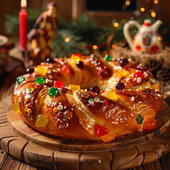
Immagina un mondo in cui le festività natalizie non finiscono il 25 dicembre. No, señoras y señores, si est...
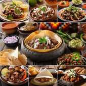
Una festa nel piatto: i segreti saporiti della cucina messicana Immagina di entrare in una fiesta messic...
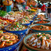
Parti per un'avventura culinaria: le meraviglie dei frutti di mare messicani Immagina questo: sei appoll...
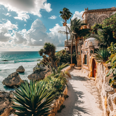
Parti per un'avventura culinaria: cibi messicani esotici che stuzzicheranno le tue papille gustative Se ...
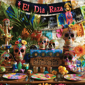
Scatena la furia festosa: forniture definitive per il tuo El Día De La Raza Bash! Immaginate questo: un ...
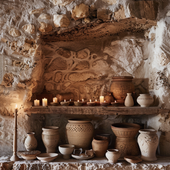
Benvenuti nel sacro santuario dell'umorismo, dove mescoliamo la spiritualità con un pizzico di arguzia. Ogg...
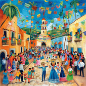
Saluti, menti curiose e amanti delle feste! Oggi ci immergiamo a cucchiaio in una tradizione che prevede ca...
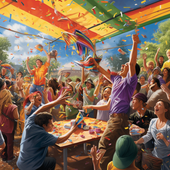
"Portare la festa a nuovi livelli: scopri l'emozionante mondo dei set di bastoni per piñata e bende per gli occ...
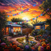
Una festa con un tocco musicale Radunatevi, amanti della Fiesta, per il paraorecchie più strano e delizi...

Il grande guacamole: scoprire l'amore per la cucina messicana Se c'è una cosa al mondo che è universalme...
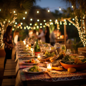
Una festa saporita: alla scoperta delle delizie gastronomiche di un buffet messicano Ti è mai capitato di rit...
¡Ay, caramba! Dimentica di distruggere le tue comuni piñatas comprate al supermercato; è tempo di tuffarsi ...
Scatena la festa nella tua moda: l'edizione grembiule Pensateci. Quante volte vi siete ritrovati a girar...
Dai una scossa a questo Cinco De Mayo Nella gloriosa sinfonia di bicchieri tintinnanti e di allegria chi...

Signore e signori, ragazzi e ragazze, preparatevi mentre ci imbarchiamo in un viaggio colorato nel cuore de...
Hola amigos y amigas! Siete pronti a indossare il vostro sombrero e a scuotere le vostre maracas? Il Cinco ...

L'arredamento più dolce: trasformare la tua casa con l'agave Immagina di passeggiare tra i corridoi del ...
The Ultimate Fiesta: aggiungi ritmo alle tue riunioni di famiglia con la musica tradizionale messicana D...
Il curioso caso delle cartoline di ringraziamento per la riunione di famiglia messicana Immagina, se vuoi...
The Great Guacamole Gathering: come dare un tocco piccante alla tua riunione di famiglia messicana Immag...
Scopri i sapori del Messico: segreti piccanti ti aspettano in ogni buono! Benvenuti, avventurieri culinar...
Il colorato enigma: svelare il mondo delle piñata! Immagina un mondo senza piñata. Le feste di compleanno...
Una festa di tessuti e frange: la guida indispensabile per vestirsi in stile messicano! Benvenuti, mis a...
Scarta la Fiesta: bomboniere con un tocco piccante! Benvenuti, amigos e amigas, alla guida definitiva su...
Hai mai sorseggiato un margarita direttamente dal seno di un bicchiere di cactus mentre allegre melodie mar...
Una festa all'insegna della galleggiabilità: palloncini per El Grito! Immaginate questo: il cielo è tan...
Santo cielo, cos'è il Grito de Dolores? Ciao a tutti, appassionati di storia e fanatici delle feste! Vi ...
Boom! Fizzle! Pop! Ah, la sinfonia dei fuochi d'artificio del Giorno dell'Indipendenza messicana, un taco u...
La battaglia dei bulbi in fiore: un enigma colorato Avanti, signore e signori, nel mondo creativo e color...
Svelare i misteri delle tradizioni secolari Benvenuti, anime curiose e amanti della cultura! Vi è mai ca...
Scatena la tua festa interiore con stravaganti accessori per il photo booth! Immagina questo: sei a una ...
Che la festa abbia inizio: un viaggio fotografico attraverso le celebrazioni indigene del Messico Signore...
Scatena lo chef che è in te con i sapori antichi: un assaggio del Messico indigeno Immagina di brandire u...
La vasta gamma di espressioni culturali Immagina questo: stai scorrendo infinite pagine di arte murale i...
Oh mio Dio, prendi il tuo sombrero e un espresso, perché avrai bisogno di entrambe le mani libere per applau...
Ti è mai capitato di sederti a una cena, guardare il tavolo e pensare: "Cavolo, vorrei tanto vedere di più ...
Certo! Eccoci qui: Il ritmo della tradizione: alla scoperta del vivace patrimonio musicale del Messico ...
Signore, signori e tutti coloro che amano le feste, avvicinatevi perché stiamo per svelare il vivace arazzo...
Alla scoperta del tesoro: il mondo stravagante dell'artigianato indigeno messicano Prendetevi un momento...
Signore e signori, tenete i vostri tacos e preparatevi per un viaggio pirotecnico che non avete chiesto, ma...
Ammettiamolo, amigos e amigas: quando si tratta di ravvivare una fiesta, poche cose gridano "Viva il Messic...
Quando il cielo brilla: abbracciare il Fuego con una risata e una fibbia Siete mai stati a una festa mess...
Il fascino esplosivo dei cieli notturni messicani Se gli incantevoli paesaggi del Messico e le delizie c...
Svelare i fili del tempo con i manifesti indigeni messicani Perché gli antichi geroglifici egizi o le mi...
Benvenuti, lettori curiosi, nel mondo stravagante del benessere, dove l'antica saggezza incontra le risate ...
Accendi la notte con una scintilla Immagina questo: sei a casa, l'orologio batte l'ora per dare inizio a...
Il dibattito sulle fontane luminose: perché i fuochi d'artificio al chiuso sono ormai una tradizione Imm...
Esplodere di eccitazione: perché la tua festa ha bisogno di fuochi d'artificio Immaginate questo: siete ...
Signore, signori e appassionati di fuochi d'artificio di tutte le età, radunatevi! Siete stanchi delle soli...
Ammettiamolo, l'unica cosa che oscura lo spettacolo scintillante dei fuochi d'artificio è l'esibizione dell...

💖 Senti lo Spirito della Fiesta con LA AGUILA 💖 Alcune magliette sono solo tessuto, ma questa? È un simbolo della tua eredità, de...
Visualizza tutti i dettagli
🦅 Abbraccia lo Spirito di Libertà con LA ÁGUILA 🦅 Alcune magliette catturano un momento. Ma questa? È un omaggio allo spirito aud...
Visualizza tutti i dettagli
💖 Spiega le Ali con La Águila 💖 Alcune magliette sono solo dei disegni, ma questa? È il tuo spirito, la tua cultura, il tuo orgog...
Visualizza tutti i dettagli
💖 Senti lo Spirito della Tradizione, Vivi il Divertimento 💖 Ogni partita di Lotería porta con sé ricordi: risate, competizione e ...
Visualizza tutti i dettagli
💖 Abbraccia la Tua Eredità con un Tocco Audace 💖 C'è una sensazione che provi quando indossi qualcosa che è più di un semplice tes...
Visualizza tutti i dettagli
💖 Un Ricordo che Puoi Conservare per Sempre 💖 Alcune magliette sono solo vestiti, ma questa? È te. È la tua storia, la tua cultur...
Visualizza tutti i dettagli
💖 Abbraccia lo Spirito dell'Aquila 💖 Questa non è solo una maglietta. Questa è la tua occasione per indossare il simbolo di for...
Visualizza tutti i dettagli
💖 Vola Alto con un Pezzo di Tradizione 💖 Alcune maglie sono solo vestiti—ma questa? È il tuo legame con la tua eredità. Con il des...
Visualizza tutti i dettagli
💖 Senti lo Spirito di Libertà ad Ogni Indosso 💖 Alcune magliette sono più che semplici tessuti: portano con sé storie, cultura e...
Visualizza tutti i dettagli
💖 Scatena lo Scienziato che è in Te 💖 Dicono che la scienza sia un mondo a sé stante—un'avventura che svela i misteri della vita....
Visualizza tutti i dettagli
💖 Per Amore della Scienza e dello Stile 💖 Alcune magliette sono solo vestiti, ma questa? È una celebrazione di chi sei: un clinic...
Visualizza tutti i dettagli
💜 Scatena il Tuo Superpotere con Stile! 💜 Certe giornate, devi semplicemente abbracciare il cinico che è in te. E ora, puoi indos...
Visualizza tutti i dettagli
💖 Indossa la Tua Essenza, Abbraccia la Tua Cultura 💖 Alcune magliette sono solo magliette—ma questa? È la tua storia, che prende ...
Visualizza tutti i dettagli
💖 La Tua Vibrazione, La Tua Lotería 💖 Immagina di entrare in una stanza e sentire tutti gli occhi puntati su di te. Non perché ci...
Visualizza tutti i dettagli
💖 Scatena l'Icona che è in Te 💖 Alcune magliette sono solo vestiti, ma questa? È una dichiarazione. Un audace mix di divertimento...
Visualizza tutti i dettagli
💖 Il Tuo Cuore, La Tua Storia, Il Tuo Orgoglio 💖 Alcune magliette sono solo magliette, ma questa? È di più. È la tua personale ce...
Visualizza tutti i dettagli
💖 Il Tuo Stile, La Tua Storia 💖 Ogni design ha una storia, ma questo? È una celebrazione di te, racchiusa nei colori vivaci e nel...
Visualizza tutti i dettagli
💖 La Magia della Nostalgia e della Cultura Combinate 💖 Alcune magliette sono solo vestiti—ma questa? È la tua eredità. È una gioio...
Visualizza tutti i dettagli
💖 Indossa la Tua Storia, Vivi la Tua Eredità 💖 Ogni design racconta una storia, ma alcuni vanno ancora più in profondità. Immagin...
Visualizza tutti i dettagli
💖 La Tua Nuova T-Shirt Preferita 💖 Alcune magliette sono solo vestiti—ma questa? È te. È la tua storia, il tuo stile, le tue radi...
Visualizza tutti i dettagli
💖 La Tua Storia, Intessuta in Ogni Filo 💖 Immagina di indossare qualcosa che racchiuda la tua essenza, il tuo patrimonio e la tua...
Visualizza tutti i dettagli
💖 La Tua Nuova Maglietta Preferita Ti Aspetta 💖 Hai mai trovato una maglietta che sembra fatta apposta per te? È esattamente quel...
Visualizza tutti i dettagli
💖 La Tua Storia, Il Tuo Stile 💖 Alcune magliette sono solo vestiti, ma questa? È un riflesso di te. Racconta la tua storia, celeb...
Visualizza tutti i dettagli
💖 Le Tue Origini, La Tua Storia, Il Tuo Stile 💖 Alcune magliette sono più di semplici indumenti: sono un riflesso di chi sei e d...
Visualizza tutti i dettagli English


Lascia un commento