

Cart

Have you ever gazed at a Mexican mural and felt the rush of energy that the bold colors and shapes create? Imagine channeling that same sense of vibrancy and excitement into a web design. Just like the art on the walls of Mexico, contrasting colors and shapes in digital design can elevate user experience and create interfaces that pop. But here’s the catch: this isn’t just about looking pretty – it’s about engagement, ease of navigation, and turning a webpage into a masterpiece. Let’s dive into how the boldness of Mexican murals can inspire your next web interface!
Mexican murals are iconic for their striking contrasts. The use of bold, often clashing colors and geometric shapes creates a visual dialogue that grabs attention. When you think of famous murals by artists like Diego Rivera or David Siqueiros, you don’t just think of colors on a wall – you think of stories, emotions, and movement. These murals use contrast not only to grab attention but to direct the viewer’s gaze and tell a story. By applying the same principles to web design, we can capture that same dynamic energy, guiding users through the content with ease.
In web design, contrast is not just a stylistic choice – it’s a functional one. Much like a mural, contrasting colors can serve as a visual guide, helping users navigate through a page. For instance, high-contrast color combinations like black and white, or bright reds and cool blues, make text easier to read and elements more clickable. It creates visual hierarchy, which means users know exactly where to look and what to interact with first. This is the kind of user-centered design that keeps people engaged and, ultimately, drives conversions.
Mexican murals are also known for their strong geometric shapes. These shapes, sometimes angular, sometimes curved, create movement and flow across the surface. In web design, using bold shapes can achieve similar effects. For example, rounded buttons with a contrasting background can draw attention, guiding users to take action. It’s about creating visual cues that lead the eye exactly where you want it. Just like in a mural, the shapes on your site can tell a story, creating rhythm and pace that keeps users engaged.
So, how can you translate the contrasting elements of Mexican murals into your web interface? Start by playing with color pairings that create visual interest without overwhelming your users. Use complementary colors – like warm oranges with cool blues – for a balanced yet engaging feel. For shapes, don’t be afraid to break away from traditional rectangular elements. Circles, triangles, and organic shapes can add a unique flair that keeps things dynamic. Just like a mural, every shape and color choice should serve a purpose, whether it’s to highlight an important button or break up sections of text.
Incorporating contrasting colors and shapes from Mexican murals into your web design isn’t just about aesthetics – it’s about creating a more engaging, user-friendly experience. By drawing inspiration from the boldness and energy of mural art, you can craft a web interface that’s not only visually stunning but also intuitive and easy to navigate. The next time you update your website, remember: a little contrast goes a long way in creating something memorable.
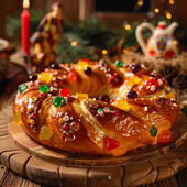
Imagínese un mundo en el que las festividades navideñas no terminan el 25 de diciembre. No, señoras y señor...
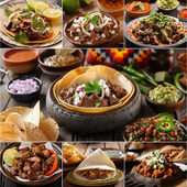
Una fiesta en tu plato: los sabrosos secretos de la cocina mexicana Imagínate entrar a una fiesta mexica...
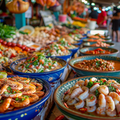
Embárcate en una aventura culinaria: las maravillas de los mariscos mexicanos Imagínese esto: está senta...
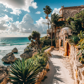
Embárcate en una aventura culinaria: platos mexicanos exóticos que deleitarán tu paladar Si pensabas que...
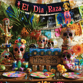
Desata la furia festiva: ¡Últimos suministros para tu fiesta de El Día De La Raza! Imagínense esto: esta...
Bienvenidos al santuario sagrado del humor, donde combinamos la espiritualidad con una pizca de ingenio. Ho...
Saludos, mentes curiosas y entusiastas de las fiestas. Hoy, nos sumergiremos de lleno en una tradición que ...
"Lleva la fiesta a nuevas alturas: descubre el apasionante mundo de los sets de palitos de piñata y antifaces" ...
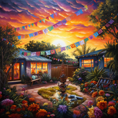
Una fiesta con un toque musical Reúnanse, aficionados a la Fiesta, para disfrutar de la más extraña y en...

La gran aventura del guacamole: desvelando el amor por la cocina mexicana Si hay algo en este mundo que ...
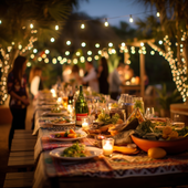
Una fiesta llena de sabor: navegando por las delicias gastronómicas de un buffet mexicano ¿Alguna vez te has ...
¡Ay, caramba! Olvídate de destrozar las piñatas genéricas que compras en las tiendas; es hora de sumergirte...
Dale rienda suelta a la fiesta en tu moda: La edición delantal Piénsalo. ¿Cuántas veces te has encontrad...
Dale un giro a tu vida este Cinco de Mayo En medio de la gloriosa sinfonía de copas que tintinean y víto...

Damas y caballeros, niños y niñas, prepárense para embarcarse en un colorido viaje al corazón de la vibrant...
¡Hola amigos y amigas! ¿Están listos para ponerse el sombrero y agitar las maracas? El Cinco de Mayo se nos...

La decoración más dulce: transforma tu hogar con agave Imagínate paseando por los pasillos de tu vivero ...
La fiesta definitiva: cómo darle ritmo a tus reuniones familiares con música tradicional mexicana Dile a...
El curioso caso de las tarjetas de agradecimiento por reuniones familiares mexicanas Imagínese un día cal...
La gran reunión del guacamole: cómo darle un toque picante a tu reunión familiar mexicana Imagínate esto...
Descubra los sabores de México: ¡secretos picantes le esperan en cada cupón! ¡Bienvenidos, aventureros cu...
El enigma colorido: ¡desentrañando el mundo de las piñatas! Imagínense un mundo sin piñatas. Las fiestas ...
Una fiesta de telas y flecos: ¡La guía imprescindible para vestir a la mexicana! ¡Bienvenidos, amigos, a...
Descubre la Fiesta: ¡Regalos de fiesta con un toque picante! Bienvenidos, amigos y amigas, a la guía def...
¿Alguna vez has bebido una margarita directamente del fondo de una copa de cactus mientras suenan alegres m...
Una fiesta de flotación: ¡Globos para El Grito! Imagínense esto: el cielo está tan oscuro y brillante c...
Santo Topo, ¿Qué es el Grito de Dolores? ¡Hola, aficionados a la historia y fanáticos de las fiestas! ¿A...
¡Boom! ¡Fizzle! ¡Pop! Ah, la sinfonía de los fuegos artificiales del Día de la Independencia de México, un ...
La floreciente batalla de los bulbos: un enigma colorido ¡Damas y caballeros, pasen al mundo creativo y c...
Desentrañando los misterios de las tradiciones ancestrales ¡Bienvenidos, almas curiosas y amantes de la ...
¡Da rienda suelta a tu fiesta interior con accesorios extravagantes para fotomatón! Imagínate esto: está...
Que empiece la fiesta: un recorrido fotográfico por las celebraciones indígenas de México Damas, caballer...
Libera al chef que llevas dentro con sabores ancestrales: una muestra del México indígena Imagina manejar...
La amplia paleta de expresiones culturales Imagínate esto: estás desplazándote por páginas interminables...
Ay, coge tu sombrero y un espresso, porque necesitarás tener ambas manos libres para aplaudir las milagrosas...
¿Alguna vez te has sentado a una cena, has mirado la mesa y has pensado: "Vaya, me encantaría poder ver más...
¡Claro que sí! ¡Allá vamos! Al ritmo de la tradición: explorando el vibrante patrimonio musical de México...
Damas, caballeros y todos los que aman las fiestas, acérquense porque estamos a punto de desentrañar el vib...
Desenterrando tesoros: el mundo caprichoso de las artesanías indígenas mexicanas Tómate un momento, cier...
Damas y caballeros, no se llenen de tacos y prepárense para un viaje pirotécnico que no pidieron, pero que ...
Seamos realistas, amigos y amigas: cuando se trata de animar una fiesta, pocas cosas gritan "¡Viva México!"...
Cuando el cielo brilla: abrazando el fuego con una risa y una hebilla ¿Alguna vez has estado en una celeb...
El encanto explosivo de los cielos nocturnos mexicanos Si los encantadores paisajes de México y sus sabr...
Desenredando los hilos del tiempo con carteles indígenas mexicanos ¿Por qué los antiguos jeroglíficos eg...
¡Bienvenidos, lectores curiosos, al fantástico mundo del bienestar, donde la sabiduría antigua se encuentra...
Enciende la noche con un destello Imagínate esto: estás en casa, el reloj marca la hora para comenzar tu...
El debate sobre las bengalas: por qué los fuegos artificiales en interiores son cosa del pasado Imagínes...
Explosión de emoción: por qué tu fiesta necesita fuegos artificiales Imagínate esto: estás en una fiesta...
Damas, caballeros y entusiastas de la pirotecnia de todas las edades, ¡reúnanse! ¿Están cansados de las m...
Seamos realistas, lo único que eclipsa el espectáculo deslumbrante de los fuegos artificiales es el desplie...

💖 Siente el Espíritu de Fiesta con LA AGUILA 💖 Algunas camisas son solo tela, pero ¿esta? Es un símbolo de tu herencia, tus raí...
Ver todos los detalles
🦅 Adopta el Espíritu de la Libertad con LA ÁGUILA 🦅 Algunas camisetas capturan un momento. ¿Pero esta? Es un homenaje al espíri...
Ver todos los detalles
💖 Extiende Tus Alas con La Águila 💖 Algunas camisetas son solo diseños, ¿pero esta? Es tu espíritu, tu cultura, tu orgullo, **c...
Ver todos los detalles
💖 Siente el Espíritu de la Tradición, Vive la Diversión 💖 Cada juego de Lotería trae consigo recuerdos: risas, competencia y es...
Ver todos los detalles
💖 Abraza Tu Herencia con un Toque Audaz 💖 Hay un sentimiento que surge al usar algo que es más que solo tela. Es una historia, u...
Ver todos los detalles
💖 Un Recuerdo Que Puedes Guardar Para Siempre 💖 Algunas camisetas son solo ropa, ¿pero esta? Es **tú**. Es tu historia, tu cult...
Ver todos los detalles
💖 Abraza el Espíritu del Águila 💖 Esta no es solo una camiseta. Esta es tu oportunidad de llevar el símbolo de fuerza, libert...
Ver todos los detalles
💖 Vuela Alto con un Pedazo de Tradición 💖 Algunas camisetas son solo ropa, pero ¿esta? Es tu conexión con la herencia. Con el di...
Ver todos los detalles
💖 Siente el Espíritu de Libertad con Cada Uso 💖 Algunas camisetas son más que solo tela: transmiten historias, cultura y orgul...
Ver todos los detalles
💖 Libera a tu Científico Interior 💖 Dicen que la ciencia es un mundo en sí mismo, una aventura que desvela los misterios de la ...
Ver todos los detalles
💖 Por Amor a la Ciencia y el Estilo 💖 Algunas camisetas son solo ropa, ¿pero esta? Es una celebración de quien eres—un apasiona...
Ver todos los detalles
💜 ¡Libera Tu Superpoder con Estilo! 💜 Algunos días, simplemente tienes que abrazar al cínico que llevas dentro. Y ahora, puedes...
Ver todos los detalles
💖 Lleva tu Esencia, Abraza tu Cultura 💖 Algunas camisetas son solo camisetas, pero ¿esta? Es tu historia, plasmada en colores v...
Ver todos los detalles
💖 Tu Energía, Tu Lotería 💖 Imagina entrar a una habitación y sentir todas las miradas puestas en ti. No porque lo intentes, sin...
Ver todos los detalles
💖 Libera tu Ícono Interior 💖 Algunas camisetas son solo ropa, ¿pero esta? Es toda una declaración. Una audaz mezcla de diversió...
Ver todos los detalles
💖 Tu Corazón, Tu Historia, Tu Orgullo 💖 Algunas camisetas son solo camisetas, pero ¿esta? Es más. Es tu celebración personal de...
Ver todos los detalles
💖 Tu Estilo, Tu Historia 💖 Cada diseño tiene una historia, pero ¿este? Es una celebración de ti, envuelta en los colores vibran...
Ver todos los detalles
💖 La Magia de la Nostalgia y la Cultura Combinadas 💖 Algunas camisetas son solo ropa, pero ¿esta? Es tu herencia. Es una alegre ...
Ver todos los detalles
💖 Viste Tu Historia, Vive Tu Legado 💖 Cada diseño cuenta una historia, pero algunos van aún más profundo. Imagina llevar una pa...
Ver todos los detalles
💖 Tu Nueva Camiseta Favorita 💖 Algunas camisas son solo ropa, pero ¿esta? Esta eres tú. Es tu historia, tu vibra, tus raíces, e...
Ver todos los detalles
💖 Tu Historia, Tejida en Cada Hilo 💖 Imagina vestir algo que capture tu esencia, tu herencia y tu historia, todo en uno. Esta c...
Ver todos los detalles
💖 Tu Nueva Camiseta Favorita Te Espera 💖 ¿Alguna vez has encontrado una camiseta que sientes que fue hecha solo para ti? Eso es...
Ver todos los detalles
💖 Tu Historia, Tu Estilo 💖 Algunas camisetas son solo ropa, ¿pero esta? Es un reflejo de ti. Cuenta tu historia, celebra tus ra...
Ver todos los detalles
💖 Tu Herencia, Tu Historia, Tu Estilo 💖 Algunas camisetas son más que solo ropa: son un reflejo de quién eres y de dónde viene...
Ver todos los detalles English


Dejar un comentario