

Cart

Imagine walking through a colorful Mexican street, surrounded by murals that almost seem to jump off the wall. Those bold, bright contrasts? They’re not just eye candy—they’re designed to grab attention, create impact, and make sure everyone can enjoy the art, even if they have visual impairments. But what does this have to do with your digital design? Everything! Mexican muralists have been using color contrasts for decades to enhance accessibility, and the same principles can give your websites and apps the visual punch they need to be more inclusive and user-friendly.
When it comes to accessibility in digital design, color contrast is a game-changer. Think of it like this: just as a mural's bright red pops against a deep blue sky, the right contrast on a website makes sure text doesn’t get lost in the background. In Mexican murals, artists use contrasting colors to tell stories that anyone, regardless of vision ability, can understand. This principle translates perfectly into digital design, where high contrast can help people with visual impairments (like color blindness or low vision) navigate websites and apps more easily.
Mexican muralists, like Diego Rivera and David Siqueiros, didn’t just create art—they created accessible art. They understood that their murals would be viewed by a diverse range of people, so they used sharp color contrasts to ensure everyone could appreciate the visual story. In the world of digital design, this concept is a goldmine. By using color contrasts thoughtfully, you can help ensure that your content stands out, even for those with limited vision. It’s not just about aesthetics; it’s about inclusivity.
Think about your website or app for a second: Is the text easy to read? Does it pop against the background? If not, you might be missing out on making your design more accessible to a wider audience. Just like in murals, high contrast between text and background can drastically improve readability. This means using dark text on light backgrounds or bright accent colors on dark elements. But don’t stop there! You can play with different shades to create visual interest and ensure your design is both striking and accessible.
Ready to make your digital designs more inclusive? Here are a few practical tips that echo the timeless techniques of Mexican muralism:
Incorporating color contrasts that Mexican muralists have been perfecting for years can transform your digital designs. It's not just about making things look good; it’s about making sure everyone, no matter their vision ability, can enjoy your work. So next time you’re choosing colors for a project, think about those murals and how they made sure no one was left out. It’s not just art—it’s accessibility in action.
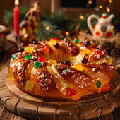
Stellen Sie sich eine Welt vor, in der die Weihnachtsfeierlichkeiten nicht am 25. Dezember enden. Nein, señ...
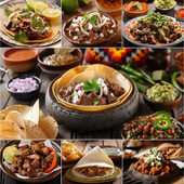
Eine Fiesta auf Ihrem Teller: Die herzhaften Geheimnisse der mexikanischen Küche Stellen Sie sich vor, S...
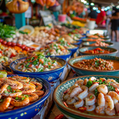
Begeben Sie sich auf ein kulinarisches Abenteuer: Die Wunder mexikanischer Meeresfrüchte Stellen Sie sic...
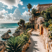
Begeben Sie sich auf ein kulinarisches Abenteuer: Exotische mexikanische Gerichte, die Ihren Gaumen kitzeln...
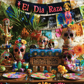
Entfesseln Sie die festliche Wut: Ultimative Vorräte für Ihre El Día De La Raza-Party! Stellen Sie sich ...
Willkommen im heiligen Schrein des Humors, wo wir Spiritualität mit einer Prise Witz verbinden. Heute tauch...
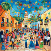
Seid gegrüßt, ihr Neugierigen und Festtagsliebhaber! Heute tauchen wir mit dem Löffel voran in eine Traditi...
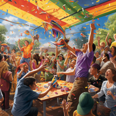
„Bringen Sie Ihre Party auf ein neues Niveau: Entdecken Sie die aufregende Welt der Piñata-Stick- und Augenbind...
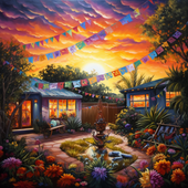
Eine Fiesta mit musikalischem Twist Versammelt euch, ihr Fiesta-Fans, für den seltsamsten und entzückend...

Der große Guacamole-Streich: Die Liebe zur mexikanischen Küche entdecken Wenn es etwas auf dieser Welt g...
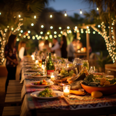
Eine geschmackvolle Fiesta: Entdecken Sie die gastronomischen Köstlichkeiten eines mexikanischen Buffets Habe...
¡Ay, Caramba! Vergessen Sie das Zerschlagen Ihrer gewöhnlichen, im Laden gekauften Piñatas; es ist Zeit, ko...
Entfesseln Sie die Fiesta Ihrer Mode: Die Schürzen-Edition Denken Sie darüber nach. Wie oft haben Sie sc...
Bringen Sie an diesem Cinco de Mayo Schwung in die Sache In der herrlichen Symphonie klirrender Gläser u...

Meine Damen und Herren, Jungen und Mädchen, machen Sie sich bereit für eine farbenfrohe Reise ins Herz der ...
Hola amigos y amigas! Seid ihr bereit, euren Sombrero aufzusetzen und eure Maracas zu schütteln? Cinco de M...

Das süßeste Dekor: Verwandeln Sie Ihr Zuhause mit Agave Stellen Sie sich vor, Sie schlendern durch die G...
Die ultimative Fiesta: Bringen Sie mit traditioneller mexikanischer Musik Rhythmus in Ihr Familientreffen ...
Der seltsame Fall der Dankeskarten zum mexikanischen Familientreffen Stellen Sie sich einen heißen, sonni...
Das große Guacamole-Treffen: Peppen Sie Ihr mexikanisches Familientreffen auf Stellen Sie sich Folgendes...
Entdecken Sie die Aromen Mexikos: In jedem Gutschein erwarten Sie würzige Geheimnisse! Willkommen, kulina...
Das bunte Rätsel: Die Welt der Piñatas enträtseln! Stellen Sie sich eine Welt ohne Piñatas vor. Geburtsta...
Ein Fest der Stoffe und Fransen: Der unverzichtbare Leitfaden für die mexikanische Kleidung! Willkommen,...
Packen Sie die Fiesta aus: Partygeschenke mit einer pikanten Note! Willkommen, Amigos und Amigas, zum ul...
Haben Sie schon einmal eine Margarita direkt aus einem Kaktusglas getrunken, während im Hintergrund fröhlic...
Ein Schwebefest: Ballons für El Grito! Stellen Sie sich Folgendes vor: Der Himmel ist so glänzend dunke...
Heiliger Maulwurf, was ist der Grito de Dolores? Hallo, Geschichtsinteressierte und Fiesta-Fans! Wurden ...
Bumm! Zischen! Knallen! Ah, die Symphonie des mexikanischen Unabhängigkeitstag-Feuerwerks, ein akustischer ...
Der blühende Kampf der Blumenzwiebeln: Ein farbenfrohes Rätsel Treten Sie ein, meine Damen und Herren, in...
Die Geheimnisse altehrwürdiger Traditionen entschlüsseln Willkommen, neugierige Seelen und Kulturliebhab...
Entfesseln Sie Ihre innere Fiesta mit verrückten Fotoautomaten-Requisiten! Stellen Sie sich vor: Sie sin...
Lasst die Fiesta beginnen: Eine fotografische Reise durch die Feste der indigenen Völker Mexikos Meine Da...
Entfesseln Sie den Koch in sich mit antiken Aromen: Ein Vorgeschmack auf das indigene Mexiko Stellen Sie ...
Die umfassende Palette kultureller Ausdrucksformen Stellen Sie sich vor: Sie blättern durch endlose Seit...
Oh je, schnappen Sie sich Ihren Sombrero und einen Espresso, denn Sie brauchen beide Hände frei, um die wund...
Haben Sie sich schon einmal zu einer Dinnerparty gesetzt, auf den Tisch geblickt und gedacht: „Junge, ich w...
Klar doch! Los geht’s: Der Rhythmus der Tradition: Erkundung des lebendigen musikalischen Erbes Mexikos ...
Meine Damen, Herren und alle, die Fiestas lieben, lehnen Sie sich näher heran, denn wir werden gleich die f...
Schätze ausgraben: Die wunderliche Welt des einheimischen mexikanischen Kunsthandwerks Nehmen Sie sich e...
Meine Damen und Herren, halten Sie Ihre Tacos zurück und machen Sie sich bereit für eine pyrotechnische Rei...
Seien wir ehrlich, Amigos und Amigas – wenn es darum geht, eine Fiesta aufzupeppen, schreit kaum etwas so s...
Wenn der Himmel funkelt: Den Fuego mit einem Kichern und einer Schnalle umarmen Waren Sie schon einmal au...
Der explosive Charme des mexikanischen Nachthimmels Wenn Mexikos bezaubernde Landschaften und pikante ku...
Die Fäden der Zeit entwirren mit Postern der indigenen Bevölkerung Mexikos Warum sollten die alten ägypt...
Willkommen, neugierige Leser, in der wunderbaren Welt des Wohlbefindens, wo alte Weisheit auf modernes Gelä...
Bringen Sie Glanz in die Nacht Stellen Sie sich Folgendes vor: Sie sind zu Hause, die Uhr schlägt die St...
Die Wunderkerzen-Debatte: Warum Indoor-Feuerwerke so was von gestern sind Stellen Sie sich Folgendes vor...
Explodierende Spannung: Warum Ihre Party ein Feuerwerk braucht Stellen Sie sich Folgendes vor: Sie sind ...
Meine Damen, Herren und Pyrotechnik-Fans jeden Alters, kommen Sie her! Haben Sie genug von den immer gleich...
Seien wir ehrlich: Das Einzige, was das schimmernde Feuerwerksspektakel noch übertrifft, ist die Sicherheit...

💖 Spüren Sie den Geist der Fiesta mit LA AGUILA 💖 Manche Shirts sind nur Stoff – aber dieses hier? Es ist ein Symbol für Ihr Erbe,...
Vollständige Details anzeigen
🦅 Erleben Sie den Geist der Freiheit mit LA ÁGUILA 🦅 Manche Shirts fangen einen Moment ein. Aber dieses hier? Es ist eine Hommage ...
Vollständige Details anzeigen
💖 Breite deine Flügel aus mit La Águila 💖 Manche Shirts sind einfach nur Designs – aber dieses hier? Es ist dein Geist, deine Kult...
Vollständige Details anzeigen
💖 Spüren Sie den Geist der Tradition, erleben Sie den Spaß 💖 Jedes Spiel von Lotería weckt Erinnerungen – Lachen, Wettbewerb und j...
Vollständige Details anzeigen
💖 Feiere deine Herkunft mit einem kühnen Twist 💖 Es gibt ein ganz besonderes Gefühl, wenn man etwas trägt, das mehr als nur Stoff ...
Vollständige Details anzeigen
💖 Eine Erinnerung zum Festhalten 💖 Manche Shirts sind einfach nur Kleidung – aber dieses hier? Es ist du. Es ist deine Geschichte,...
Vollständige Details anzeigen
💖 Entfessle den Geist des Adlers 💖 Dies ist nicht nur ein T-Shirt. Dies ist deine Chance, das Symbol für Stärke, Freiheit und St...
Vollständige Details anzeigen
💖 Fliegen Sie hoch mit einem Stück Tradition 💖 Manche Shirts sind einfach nur Kleidung – aber dieses hier? Es ist Ihre Verbindung ...
Vollständige Details anzeigen
💖 Spüren Sie den Geist der Freiheit bei jedem Tragen 💖 Manche Shirts sind mehr als nur Stoff – sie tragen Geschichten, Kultur und...
Vollständige Details anzeigen
💖 Entfessle deine innere Wissenschaftlerin / deinen inneren Wissenschaftler 💖 Man sagt, die Wissenschaft sei eine eigene Welt – ei...
Vollständige Details anzeigen
💖 Aus Liebe zur Wissenschaft und zum Stil 💖 Manche T-Shirts sind einfach nur Kleidung, aber dieses hier? Es ist eine Feier dessen,...
Vollständige Details anzeigen
💜 Entfessle deine Superkraft mit Stil! 💜 An manchen Tagen muss man den Zyniker in sich einfach gewähren lassen. Und jetzt kannst d...
Vollständige Details anzeigen
💖 Trage deinen Vibe, lebe deine Kultur 💖 Manche Shirts sind einfach nur Shirts – aber dieses hier? Es ist deine Geschichte, zum Le...
Vollständige Details anzeigen
💖 Dein Vibe, Dein Lotería 💖 Stell dir vor, du betrittst einen Raum und spürst, dass alle Augen auf dich gerichtet sind. Nicht, wei...
Vollständige Details anzeigen
💖 Entfessle deine innere Ikone 💖 Manche Shirts sind einfach nur Kleidung, aber dieses hier? Es ist ein Statement. Eine mutige Misc...
Vollständige Details anzeigen
💖 Dein Herz, Deine Geschichte, Dein Stolz 💖 Manche Shirts sind einfach nur Shirts, aber dieses hier? Es ist mehr. Es ist deine per...
Vollständige Details anzeigen
💖 Dein Stil, Deine Geschichte 💖 Jedes Design hat eine Geschichte – aber dieses hier? Es ist eine Feier deiner selbst, eingehüllt i...
Vollständige Details anzeigen
💖 Die Magie von Nostalgie und Kultur vereint 💖 Manche Shirts sind einfach nur Kleidung – aber dieses hier? Es ist dein Erbe. Es is...
Vollständige Details anzeigen
💖 Trage deine Geschichte, lebe dein Erbe 💖 Jedes Design erzählt eine Geschichte, doch manche gehen noch tiefer. Stell dir vor, du ...
Vollständige Details anzeigen
💖 Dein neues Lieblings-T-Shirt 💖 Manche Shirts sind nur Kleidung – aber dieses hier? Es ist du. Es ist deine Geschichte, dein Vibe...
Vollständige Details anzeigen
💖 Ihre Geschichte, in jeden Faden eingewebt 💖 Stellen Sie sich vor, Sie tragen etwas, das Ihr Wesen, Ihre Herkunft und Ihre Gesch...
Vollständige Details anzeigen
💖 Dein neues Lieblingsshirt wartet auf dich 💖 Hast du jemals ein Shirt gefunden, das sich anfühlt, als wäre es nur für dich gemach...
Vollständige Details anzeigen
💖 Deine Geschichte, dein Stil 💖 Manche Shirts sind einfach nur Kleidung – aber dieses hier? Es ist ein Spiegelbild von dir. Es erz...
Vollständige Details anzeigen
💖 Deine Herkunft, Deine Geschichte, Dein Stil 💖 Manche Shirts sind mehr als nur Kleidung – sie sind ein Spiegelbild dessen, wer d...
Vollständige Details anzeigen English


Einen Kommentar hinterlassen