

Cart

Ever wonder why certain colors just seem to grab your attention more than others? In Día de los Muertos portrait photography, color isn't just something pretty to look at—it's a powerful tool that can change the entire mood of an image. Imagine a portrait of a loved one surrounded by vibrant hues of marigold and purple, or perhaps the deep, mystical blues and blacks that give off a more reflective, somber vibe. The right color combination can stir emotions, tell a story, and even make a photo come alive. Intrigued? Let’s dive in and see how different color combinations can shape the mood of your Día de los Muertos portraits!
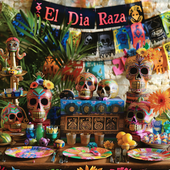
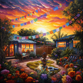
When you think of Día de los Muertos, chances are that the first colors that come to mind are the warm, rich tones like bright oranges, reds, and yellows. These colors are often used in the celebrations to represent life, warmth, and the energy that is felt during this special time. Think of the orange marigolds that are so iconic to the occasion. When incorporated into portraits, these warm hues evoke feelings of joy, celebration, and remembrance. They bring a lively and spirited energy, making the portrait feel like a tribute to the vibrancy of life and the people we honor.
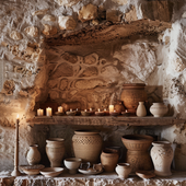
On the flip side, cool colors like deep purples, blues, and blacks can create a completely different atmosphere. These shades evoke a sense of reverence and contemplation, as well as the mystery surrounding death and the afterlife. By using these cool tones in portraits, you can give the image a more solemn and reflective mood, emphasizing the connection between the living and the departed. Whether used in the background or as an accent, these colors can create a deep, emotional pull and enhance the spiritual aspect of Día de los Muertos photography.
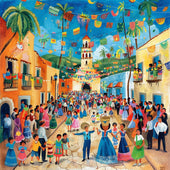
But what happens when we mix warm and cool tones together? The combination of warm oranges and reds with cool purples or blues can strike a perfect balance between celebration and reverence. This color harmony in a portrait tells a fuller story, reflecting both the joy of honoring the departed and the solemnity of the occasion. The result is a portrait that feels rich in meaning, layered with emotions that speak to both life and death. It’s like the perfect mix of fiesta and reflection, capturing the essence of Día de los Muertos in all its beauty.
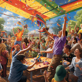
Contrasting colors can also be used to make elements of the portrait pop, creating a striking visual effect. For example, pairing vibrant yellow with deep blue or a rich red with black creates high contrast that draws the viewer’s eye to certain details. These contrasting combinations can give a sense of dynamism and drama, making the portrait feel bold and alive, yet still rooted in the traditions of Día de los Muertos. The contrast not only adds visual appeal but also emphasizes the cultural significance of the symbols and colors used.
In the world of Día de los Muertos portrait photography, color isn't just decoration—it’s a language all its own. Whether you're using warm, cool, or contrasting colors, the combination you choose can dramatically affect the mood of the image. So, the next time you’re creating a Día de los Muertos portrait, remember: the colors you choose aren’t just there to look good—they’re there to tell a story. And that story can be as vibrant, reflective, celebratory, or solemn as you want it to be!
Listen Now 0:00 0m 00s left – 0:00 ...
Listen Now 0:00 0m 00s left – 0:00 ...
Listen Now 0:00 0m 00s left – 0:00 ...
Listen Now 0:00 0m 00s left – 0:00 ...
Listen Now 0:00 0m 00s left – 0:00 ...
Listen Now 0:00 0m 00s left – 0:00 ...
Listen Now 0:00 0m 00s left – 0:00 ...
Listen Now 0:00 0m 00s left – 0:00 ...
Listen Now 0:00 0m 00s left – 0:00 ...

Listen Now 0:00 0m 00s left – 0:00 ...
Listen Now 0:00 0m 00s left – 0:00 ...
Listen Now 0:00 0m 00s left – 0:00 ...
Listen Now 0:00 0m 00s left – 0:00 ...

Listen Now 0:00 0m 00s left – 0:00 ...
Listen Now 0:00 0m 00s left – 0:00 ...

Listen Now 0:00 0m 00s left – 0:00 ...
Listen Now 0:00 0m 00s left – 0:00 ...
Listen Now 0:00 0m 00s left – 0:00 ...
Listen Now 0:00 0m 00s left – 0:00 ...
Listen Now 0:00 0m 00s left – 0:00 ...
Listen Now 0:00 0m 00s left – 0:00 ...
Listen Now 0:00 0m 00s left – 0:00 ...
Listen Now 0:00 0m 00s left – 0:00 ...
Listen Now 0:00 0m 00s left – 0:00 ...
Listen Now 0:00 0m 00s left – 0:00 ...
Listen Now 0:00 0m 00s left – 0:00 ...
Listen Now 0:00 0m 00s left – 0:00 ...
Listen Now 0:00 0m 00s left – 0:00 ...
Listen Now 0:00 0m 00s left – 0:00 ...
Listen Now 0:00 0m 00s left – 0:00 ...
Listen Now 0:00 0m 00s left – 0:00 ...
Listen Now 0:00 0m 00s left – 0:00 ...
Listen Now 0:00 0m 00s left – 0:00 ...
Listen Now 0:00 0m 00s left – 0:00 ...
Listen Now 0:00 0m 00s left – 0:00 ...
Listen Now 0:00 0m 00s left – 0:00 ...
Listen Now 0:00 0m 00s left – 0:00 ...
Listen Now 0:00 0m 00s left – 0:00 ...
Listen Now 0:00 0m 00s left – 0:00 ...
Listen Now 0:00 0m 00s left – 0:00 ...
Listen Now 0:00 0m 00s left – 0:00 ...
Listen Now 0:00 0m 00s left – 0:00 ...
Listen Now 0:00 0m 00s left – 0:00 ...
Listen Now 0:00 0m 00s left – 0:00 ...
Listen Now 0:00 0m 00s left – 0:00 ...
Listen Now 0:00 0m 00s left – 0:00 ...
Listen Now 0:00 0m 00s left – 0:00 ...
Listen Now 0:00 0m 00s left – 0:00 ...
Listen Now 0:00 0m 00s left – 0:00 ...

💖 Feel the Spirit of Fiesta with LA AGUILA 💖 Some shirts are just fabric—but this one? It’s a symbol of your heritage, your roots, your spirit. Des...
View full details
🦅 Embrace the Spirit of Freedom with LA ÁGUILA 🦅 Some shirts capture a moment. But this one? It’s a tribute to the bold, fearless spirit of the eag...
View full details
💖 Spread Your Wings with La Águila 💖 Some shirts are just designs—but this one? It’s your spirit, your culture, your pride—perfectly captured in a ...
View full details
💖 Feel the Spirit of Tradition, Live the Fun 💖 Every game of Lotería brings memories—laughter, competition, and those moments of pure joy. But what...
View full details
💖 Embrace Your Heritage with a Bold Twist 💖 There’s a feeling that comes when you wear something that’s more than just fabric. It’s a story, a cult...
View full details
💖 A Memory You Can Hold Forever 💖 Some shirts are just clothes—but this one? It’s you. It’s your story, your culture, your memories—all brought to ...
View full details
💖 Embrace the Spirit of the Eagle 💖 This isn’t just a T-shirt. This is your chance to wear the symbol of strength, freedom, and pride—captured in...
View full details
💖 Fly High with a Piece of Tradition 💖 Some shirts are just clothes—but this one? It’s your connection to heritage. With the bold, vibrant Águila d...
View full details
💖 Feel the Spirit of Freedom with Every Wear 💖 Some shirts are more than just fabric—they carry stories, culture, and pride. With the LA ÁGUILA Cu...
View full details
💖 Unleash Your Inner Scientist 💖 They say science is a world of its own—an adventure that unlocks the mysteries of life. But this La Cínica T-shirt...
View full details
💖 For the Love of Science and Style 💖 Some t-shirts are just clothes, but this one? It’s a celebration of who you are—a passionate clinician, a bri...
View full details
💜 Unleash Your Superpower with Style! 💜 Some days, you just have to embrace the cynic inside of you. And now, you can wear it proudly. This El Cini...
View full details
💖 Wear Your Vibe, Embrace Your Culture 💖 Some shirts are just shirts—but this one? It’s your story, brought to life in vibrant colors and playful d...
View full details
💖 Your Vibe, Your Lotería 💖 Imagine walking into a room and feeling all eyes on you. Not because you're trying, but because you're effortlessly glo...
View full details
💖 Unleash Your Inner Icon 💖 Some shirts are just clothing, but this one? It’s a statement. A bold mix of fun, style, and culture—this isn’t just an...
View full details
💖 Your Heart, Your Story, Your Pride 💖 Some shirts are just shirts, but this one? It's more. It’s your personal celebration of love, culture, and p...
View full details
💖 Your Style, Your Story 💖 Every design has a story—but this one? It’s a celebration of you, wrapped up in the vibrant colors and playful spirit of...
View full details
💖 The Magic of Nostalgia and Culture Combined 💖 Some shirts are just clothes—but this one? It’s your heritage. It’s a joyful celebration of traditi...
View full details
💖 Wear Your Story, Live Your Legacy 💖 Every design tells a story, but some go even deeper. Imagine wearing a piece of your culture, your memories, ...
View full details
💖 Your New Favorite Tee 💖 Some shirts are just clothes—but this one? It’s you. It’s your story, your vibe, your roots—expressed in a fun, unforgett...
View full details
💖 Your Story, Woven Into Every Thread 💖 Imagine wearing something that captures your essence, your heritage, and your story all in one. This shirt...
View full details
💖 Your New Favorite Shirt Awaits 💖 Have you ever found a shirt that feels like it was made just for you? That’s exactly what happens when you slip ...
View full details
💖 Your Story, Your Style 💖 Some shirts are just clothing—but this one? It's a reflection of you. It tells your story, celebrates your roots, and br...
View full details
💖 Your Heritage, Your Story, Your Style 💖 Some shirts are more than just clothing—they’re a reflection of who you are and where you come from. Thi...
View full details English


Leave a comment